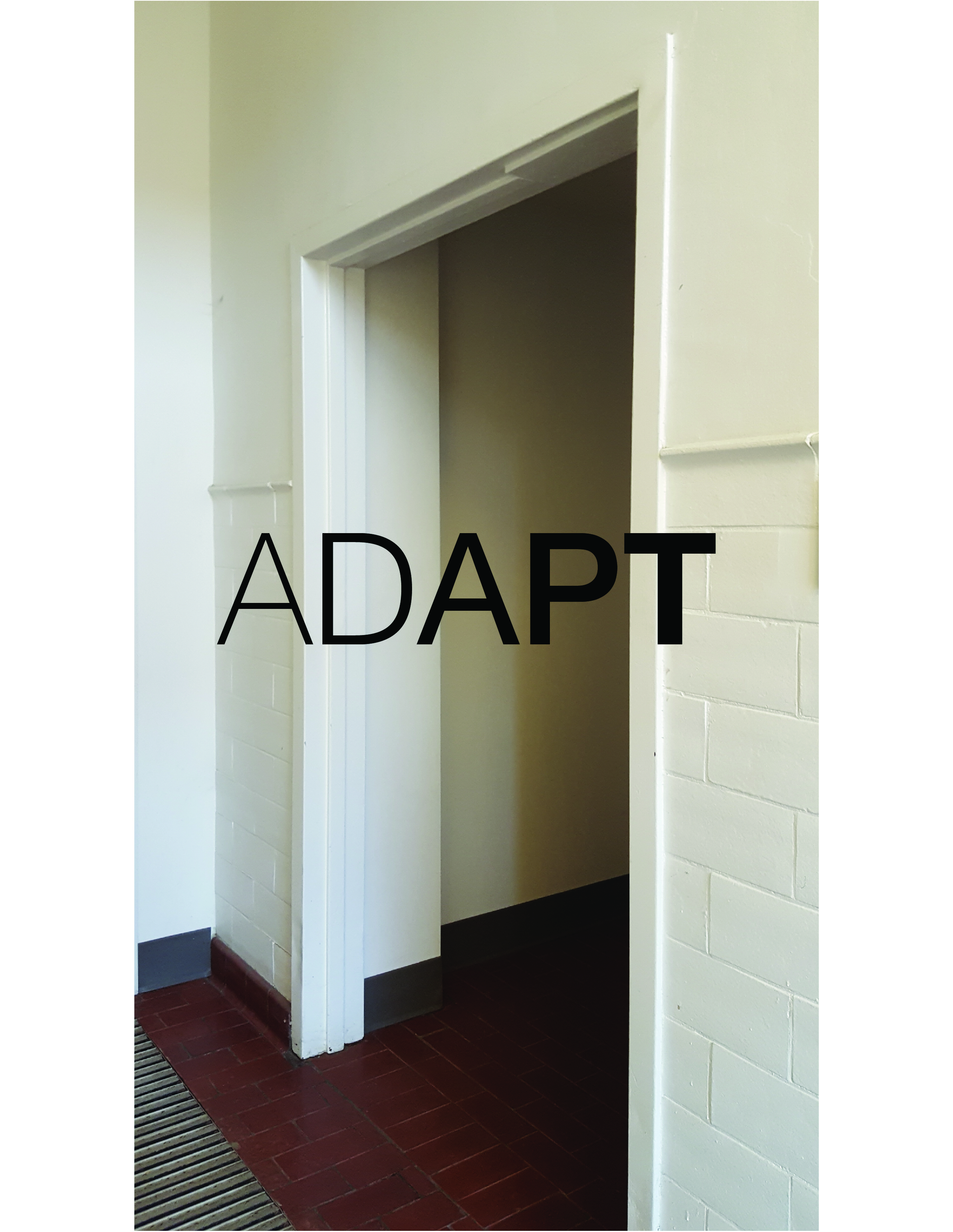
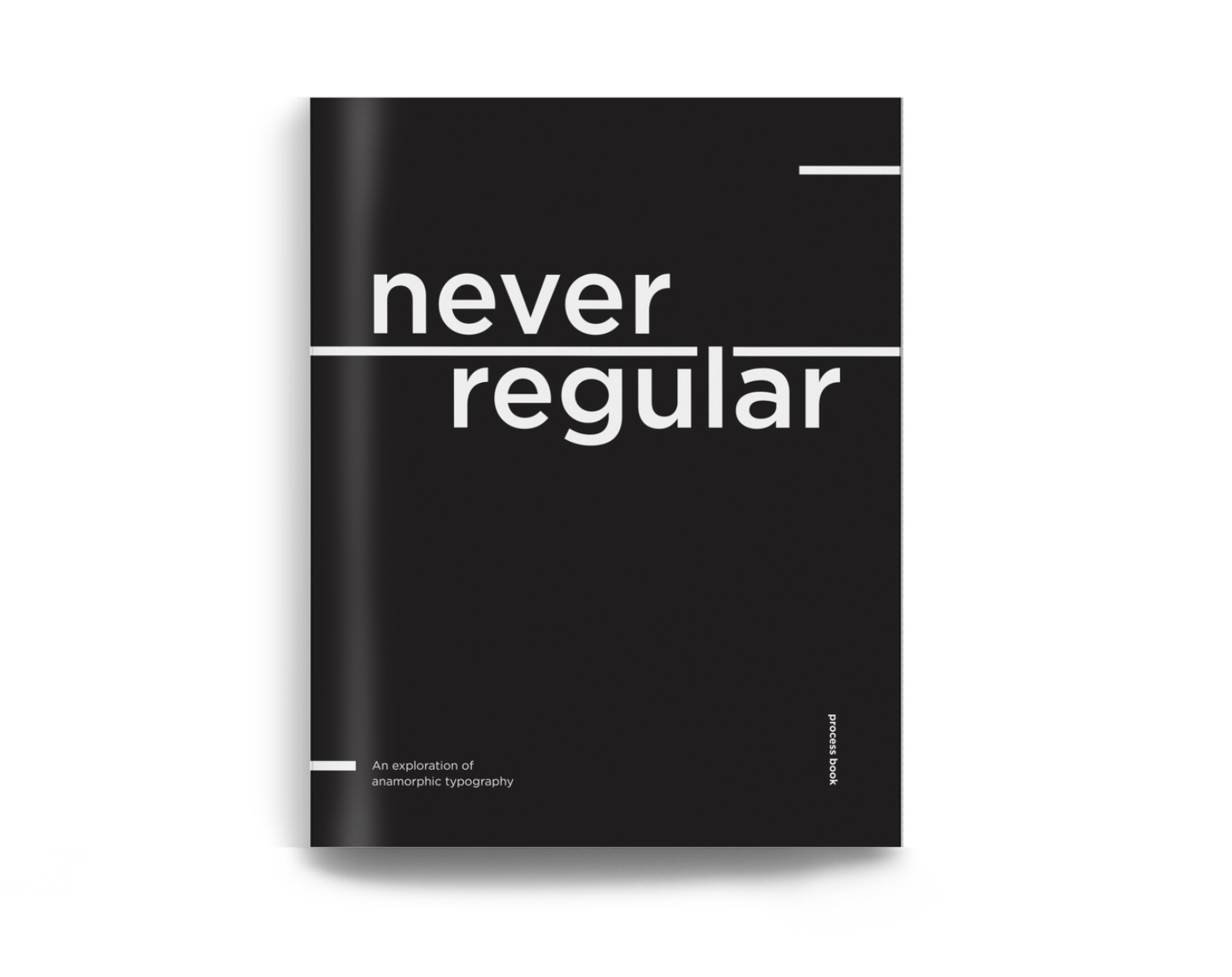
Never Regular:
Anamorphic Type - A Case Study
created in a team with Abby Blend and Amber Lai
Our goal was to take a 3-dimensional space and turn it into
an engaging and interactive typographic installation for people
walking through that environment.

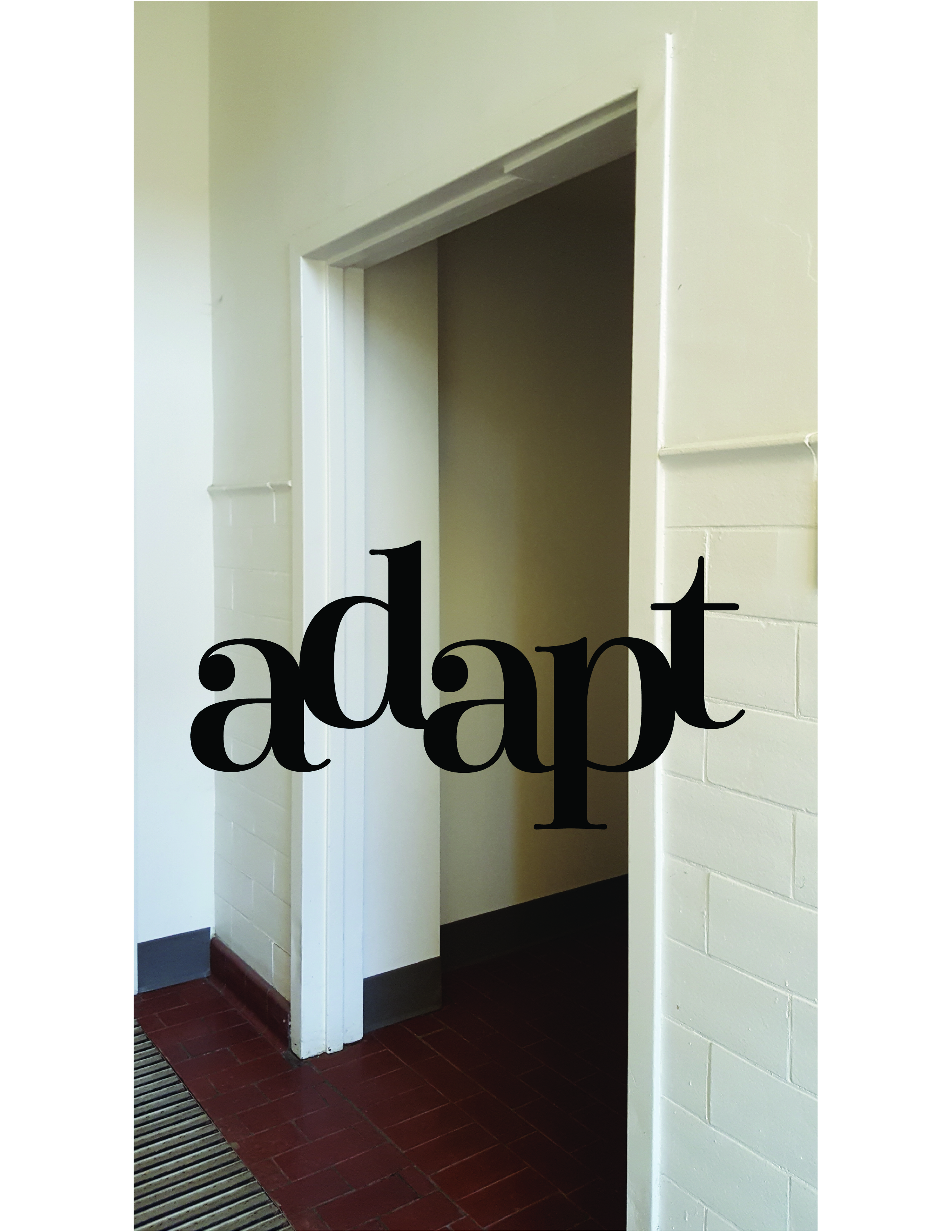
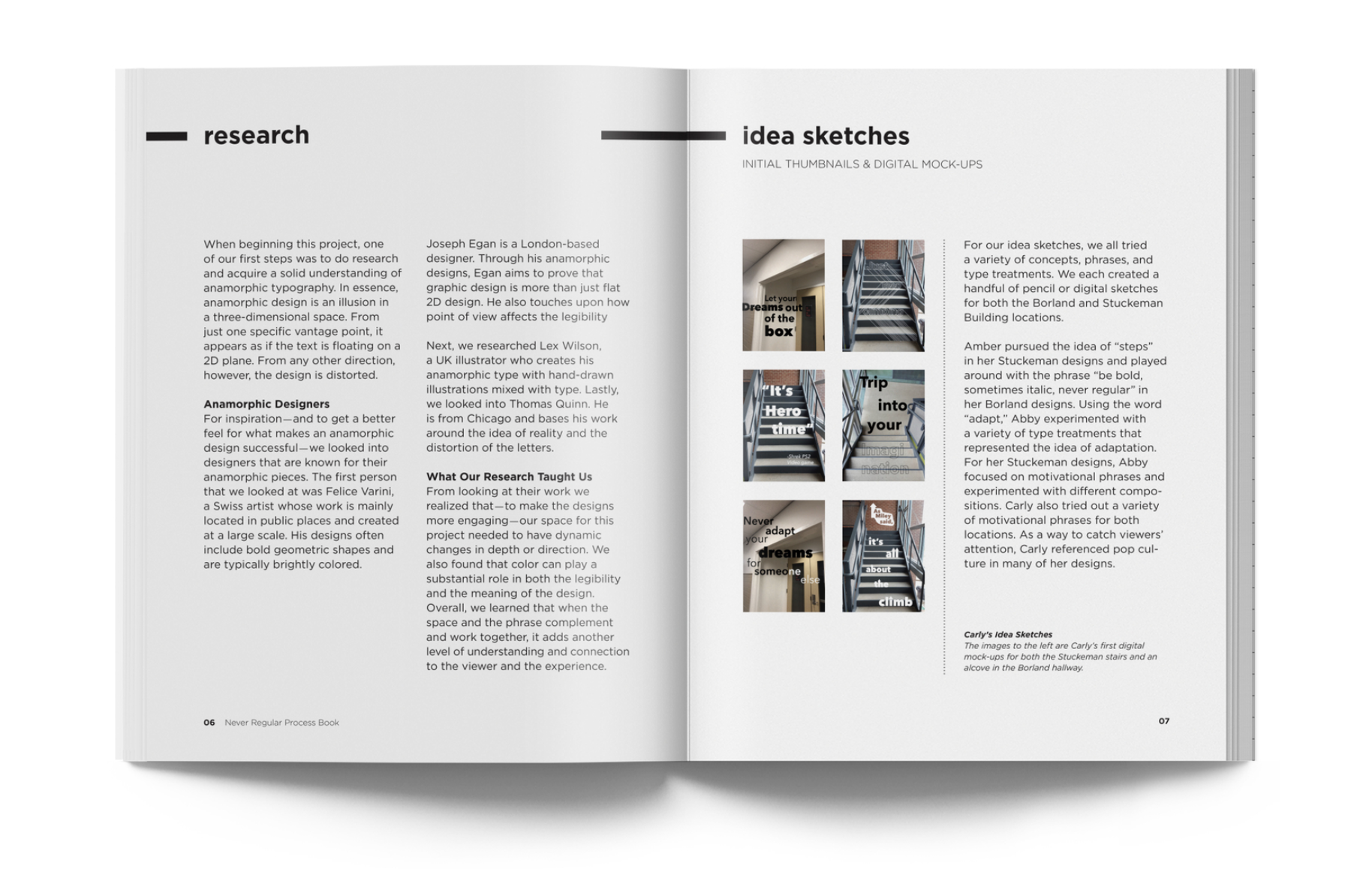
In order to carry out this project to its highest potiential, we had to get a firm grasp on what anamorphic type is and what has already been done. Anamorphic design meaning is an illusion in a three-dimensional space that from a secific vantage point the illustration comes to into its full while the other angles or view points distort the image. The typographic element is used in place of an image so that when viewed from the right spot it looks as thought text is on a two dimensional plane just as it would look like written on paper.
A couple of well known anamorphic designer we looked into for inspiration and what a sucessful execution of this design form is are Felice Varini, Joseph Egan, Thomas Quinn, and Vex Wilson. Each had their own style and way of filling the space, however as a whole we learned that to create an engaging space the space itself so be dynamic with changes in depth and direction. Legibility from the correct view point is also very important as it makes the final goal and message succesful. Another level to add and strengthen the viewers experience is having the phrase and space relate.
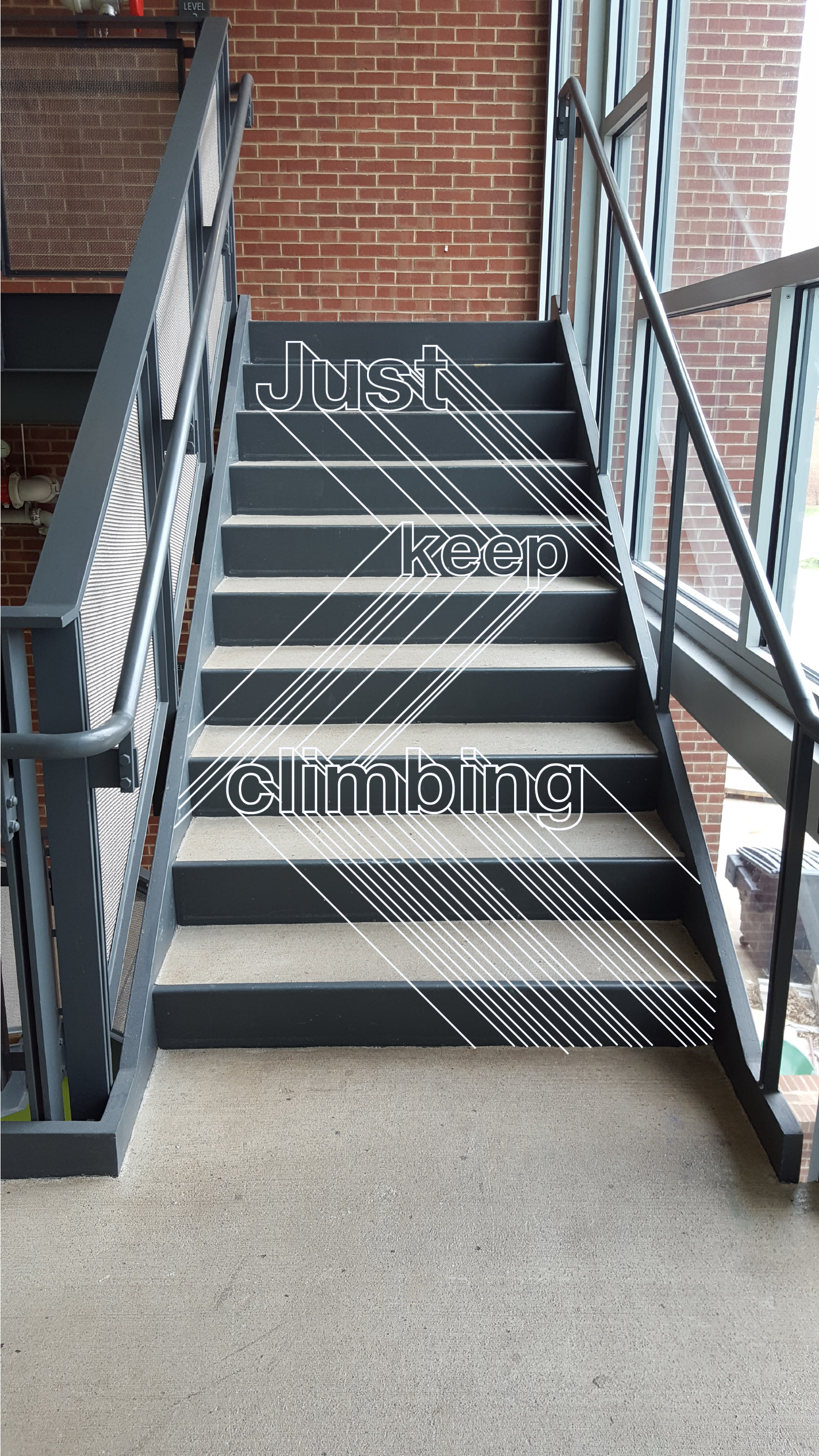

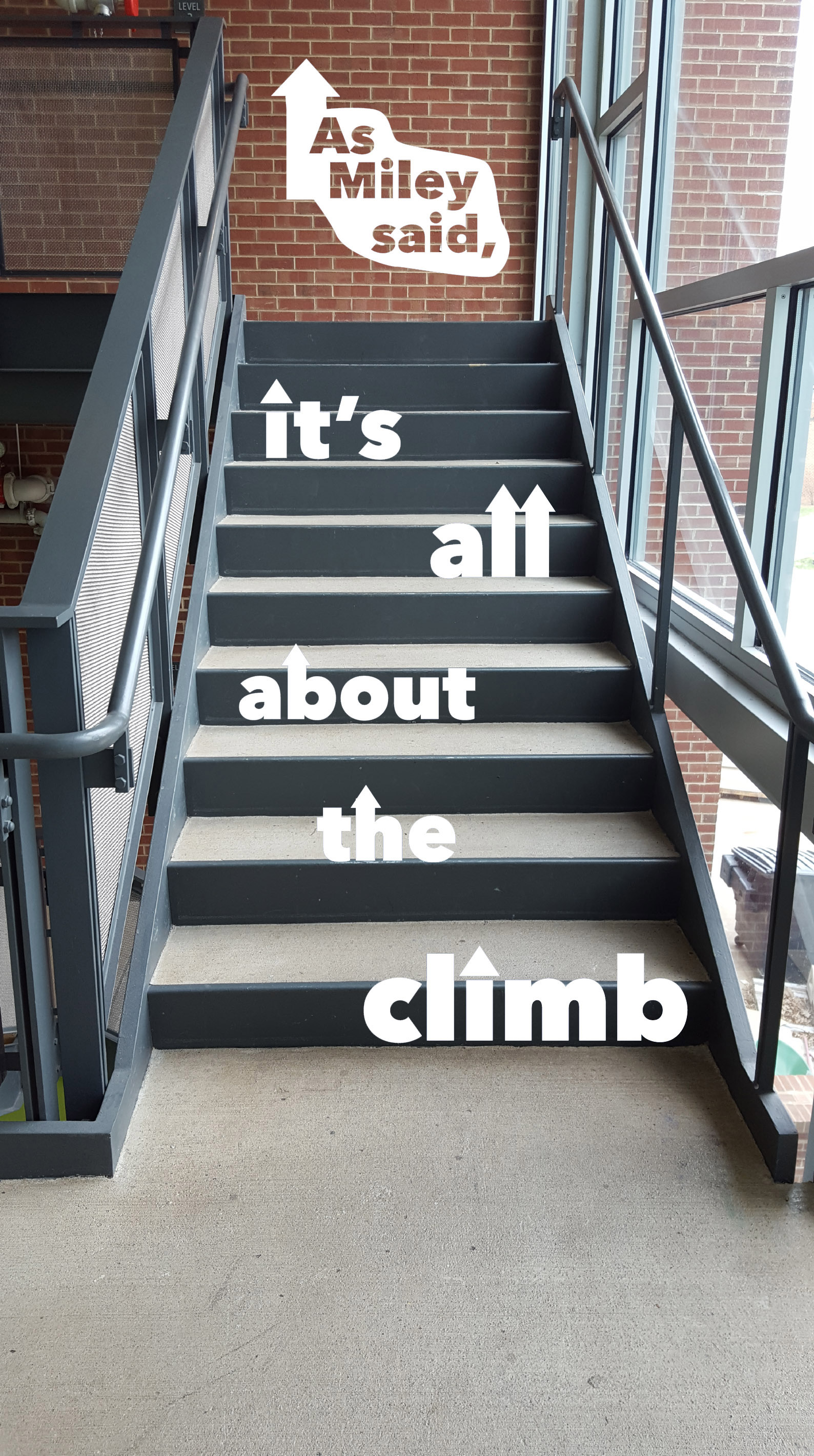
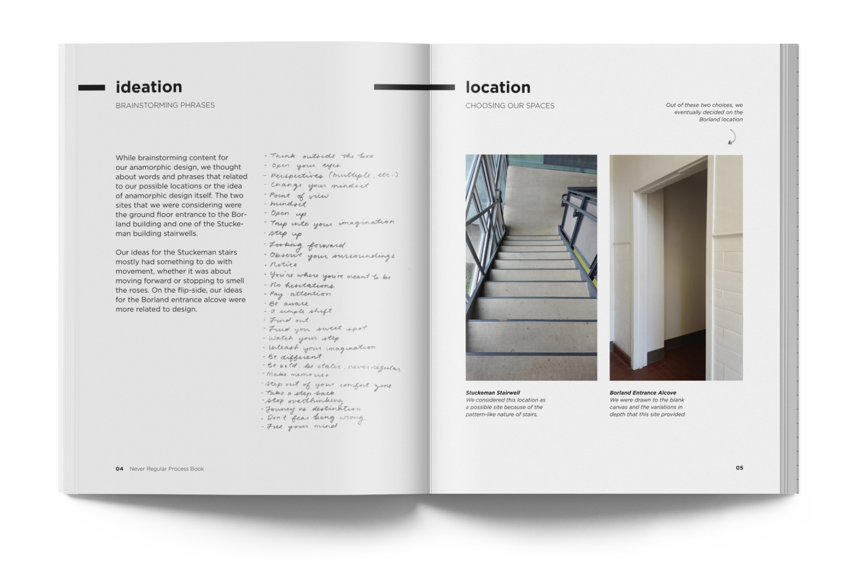
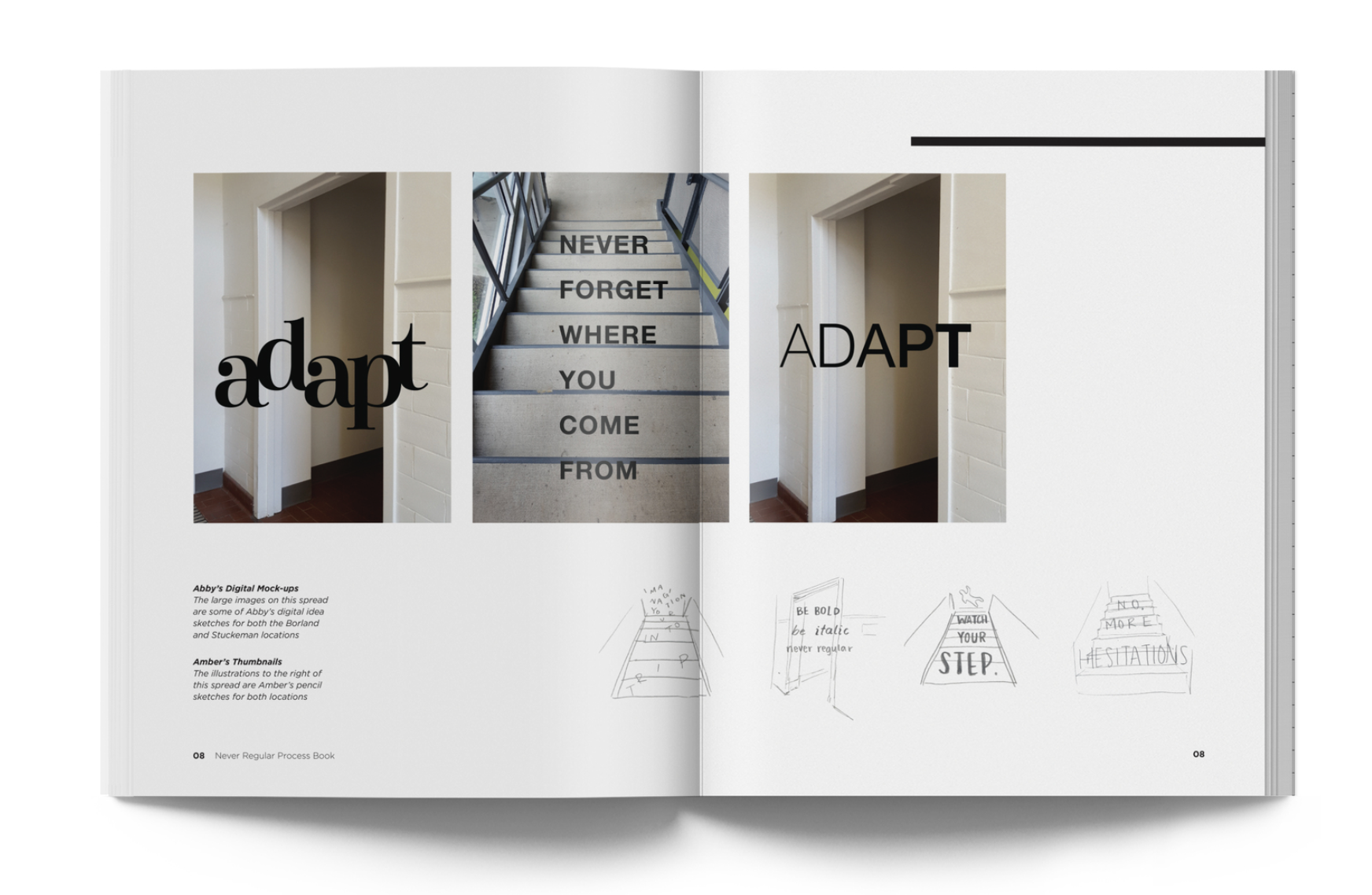
Next we began searching for different spaces that will help fulfil the lessons we learned in our research. We found some doorways and the staircase to offer the dynamics we were looking for. From these spaces, we started sketching and
ideating potenial phrases and imagery. The left images show these early sketches and digital mockups that focused on the locations themselves for inspiration of
the phrases.
the phrases.
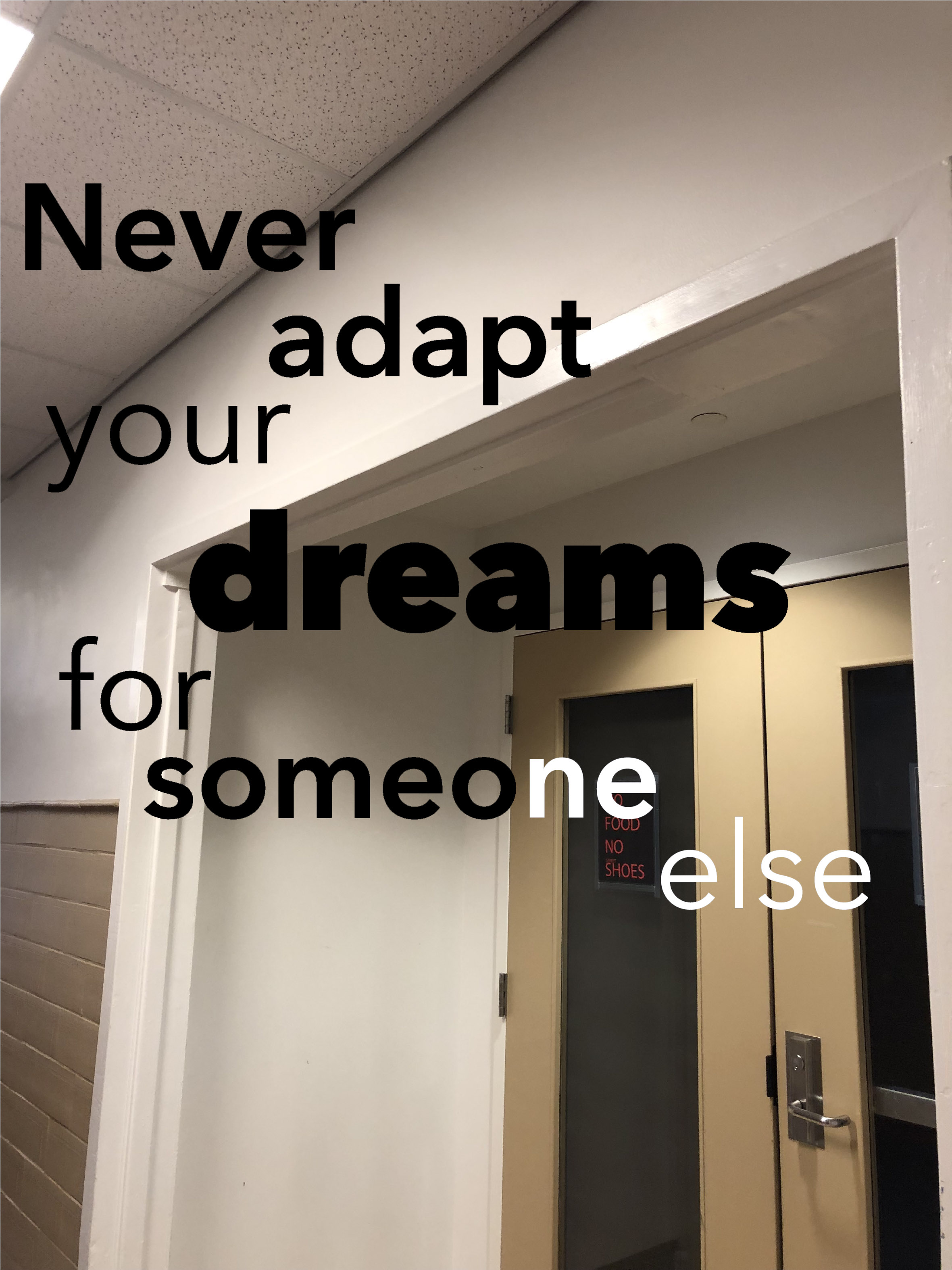
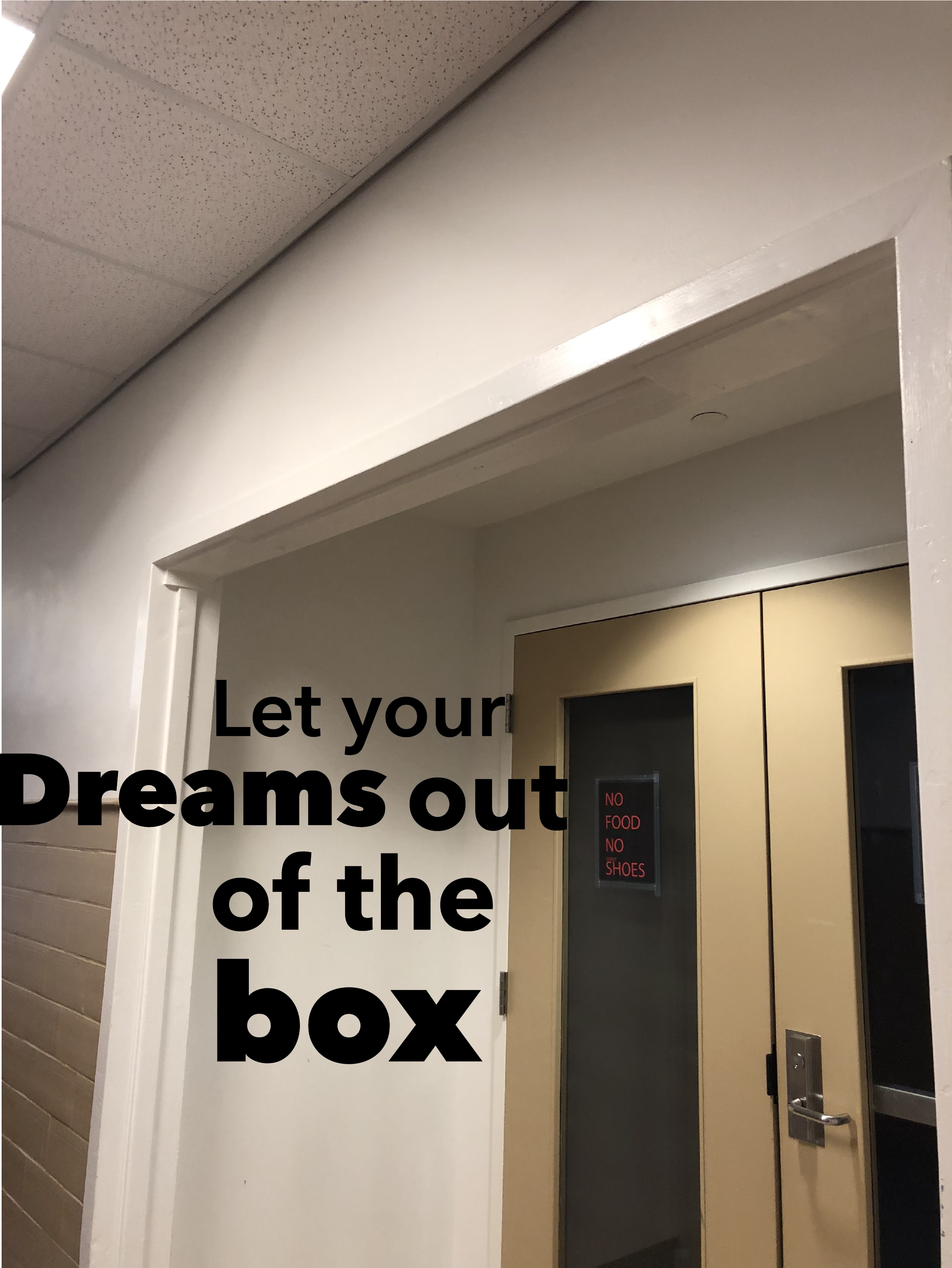
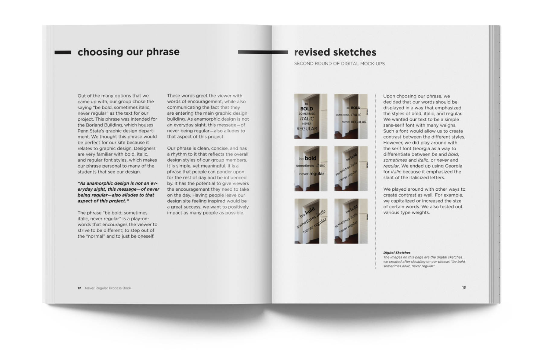
We wanted to push the phrasing from relating to just the space to include the people who will occupy the space.
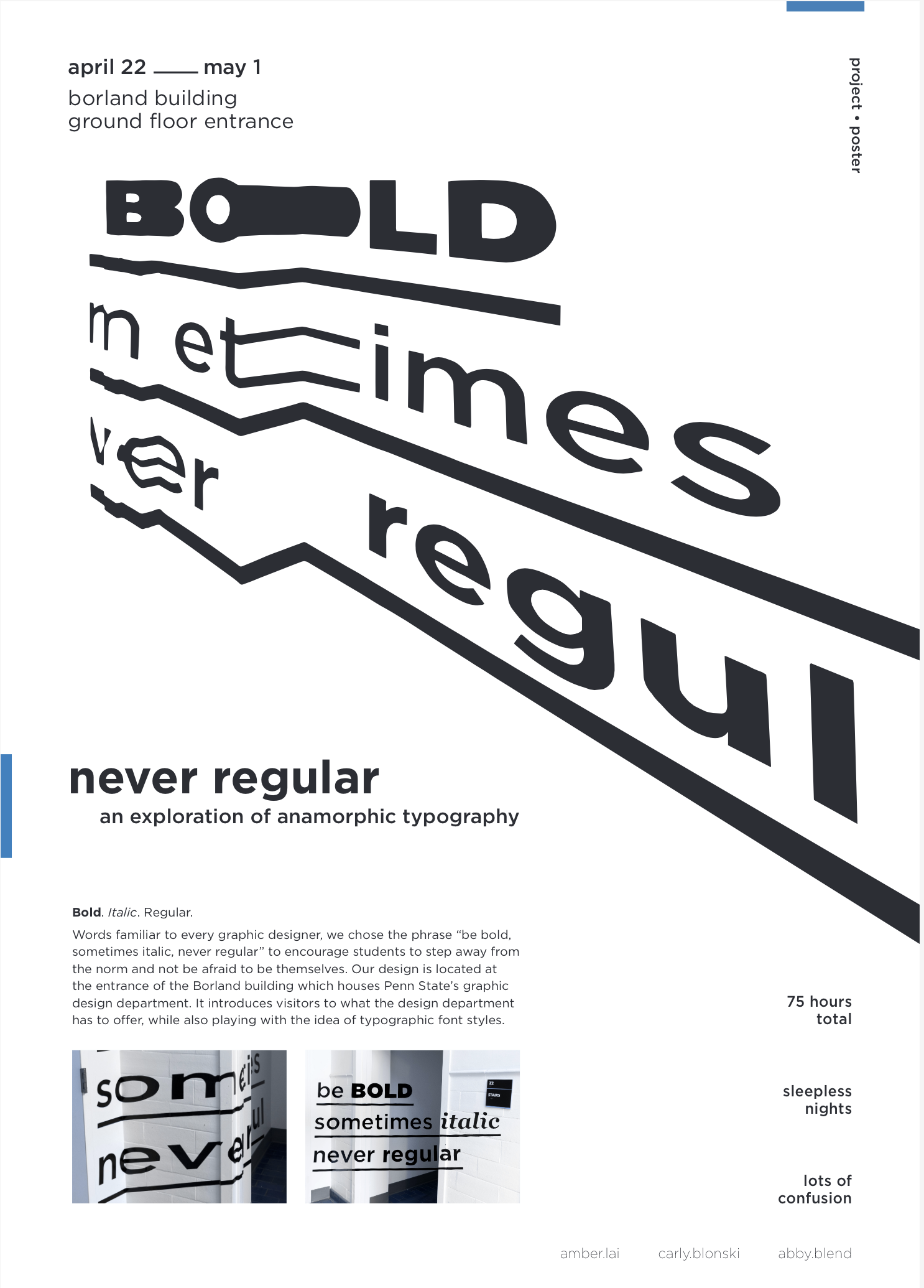
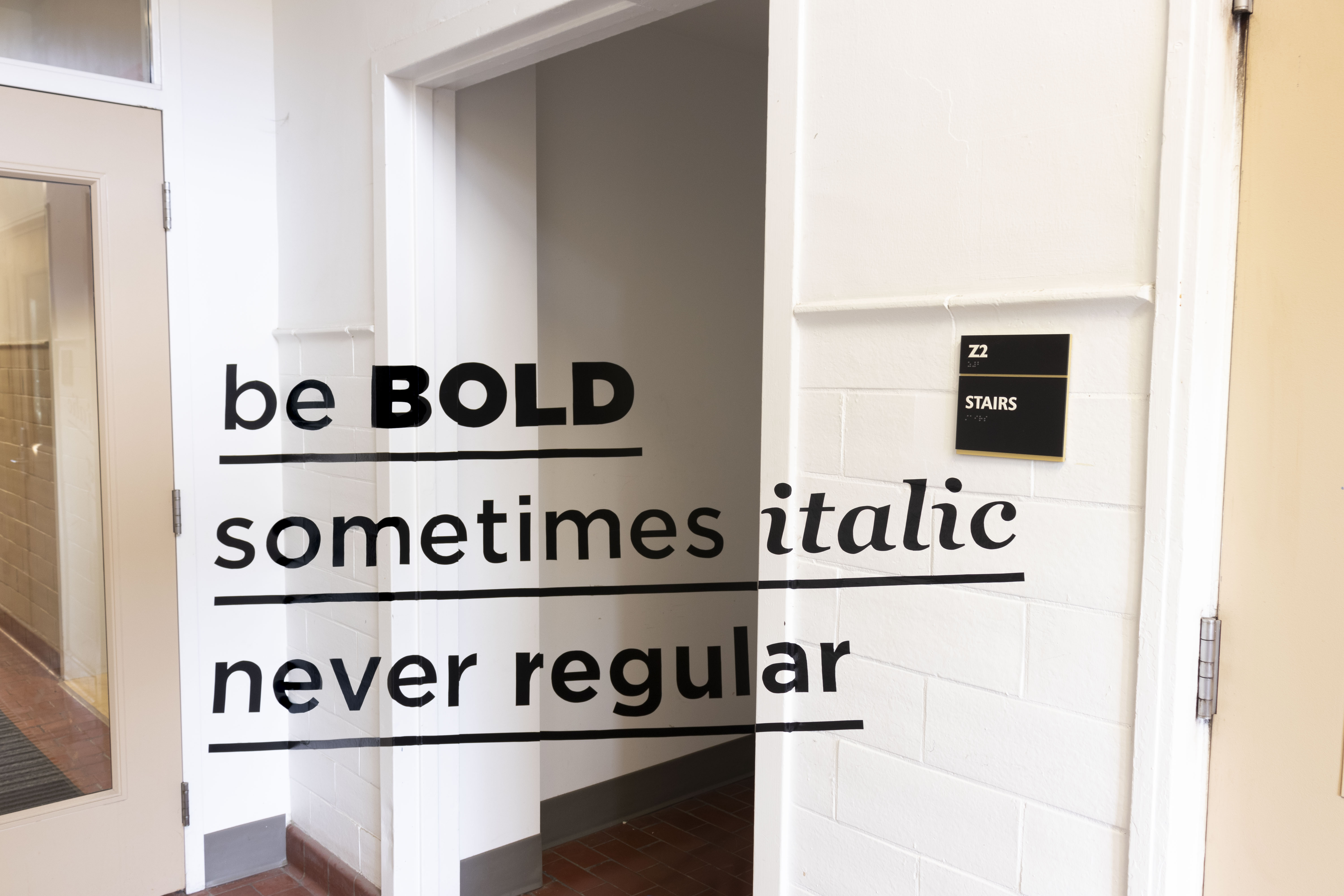
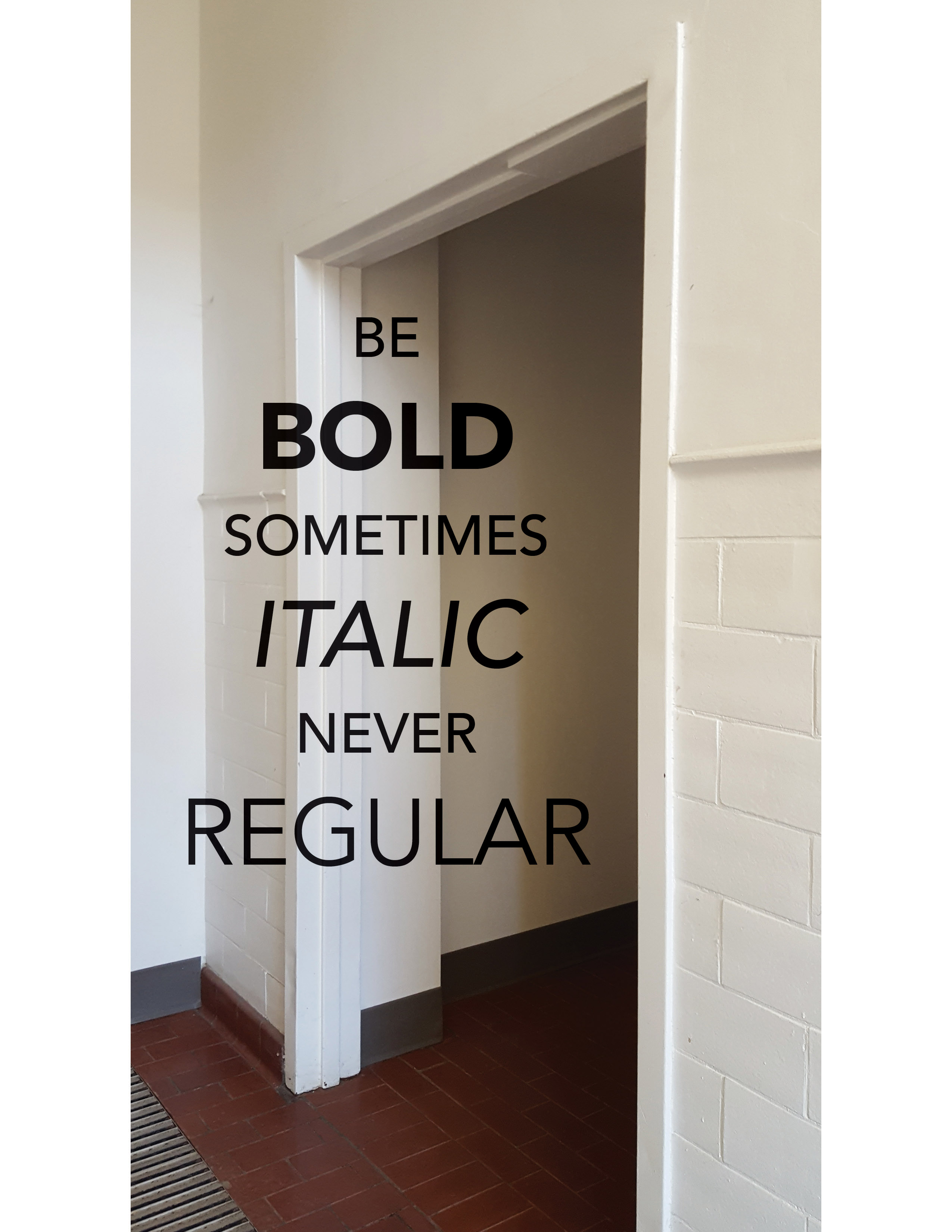
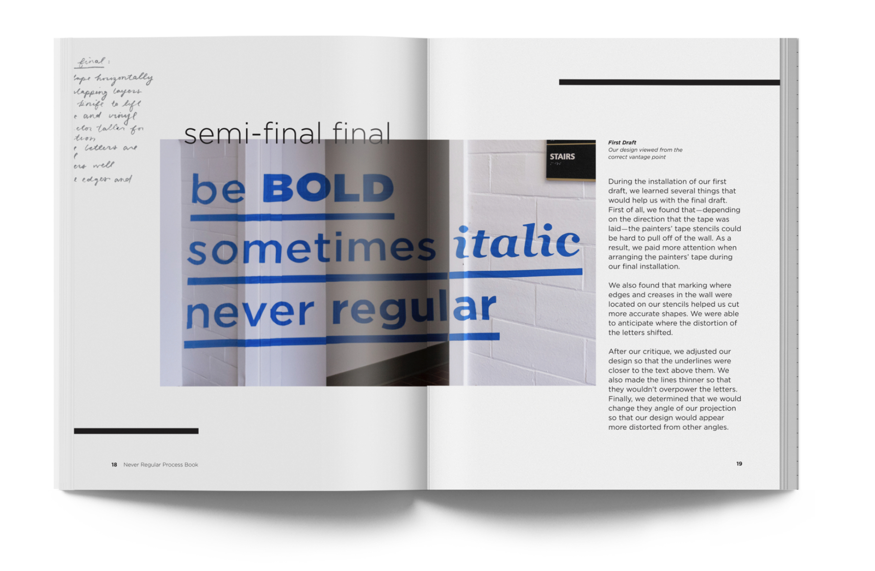
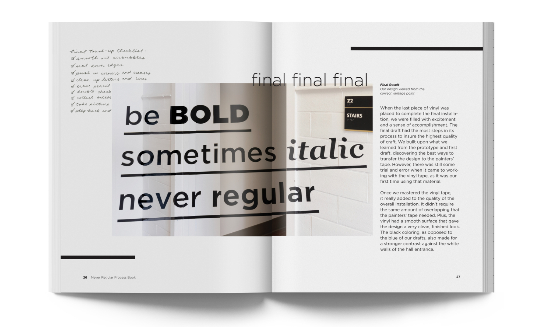
The ground floor of the Borland Building houses graphic design, photography, and film editing classes. Knowing this we decided on the phrase “Be Bold sometimes italic never regular”. It offeres not only inspiration but also plays on the typographic information that the students in the area learn and deal with on a daily basis. Designers also each have their owe uniquinesses that lets them and their work
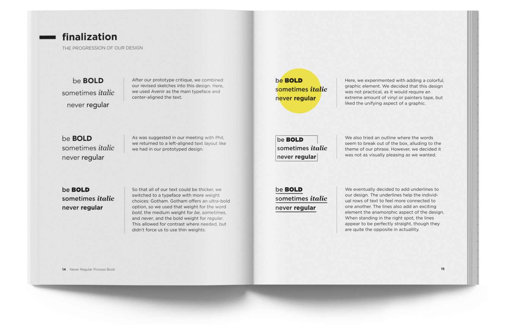
standout from the crowd. The part “be bold” is encouraging them to speak out and try their ideas, “sometimes italic” to be quicky and add your weird, and “never regular” to be original and push what is the current standards. With a set phrase and location, we went back to the drawing board to come up with new sketches and ideation on the best way to present this phrase. We tested digital mock ups of different alignments and mixed in imagery, colors, and textures as we saw from the research.

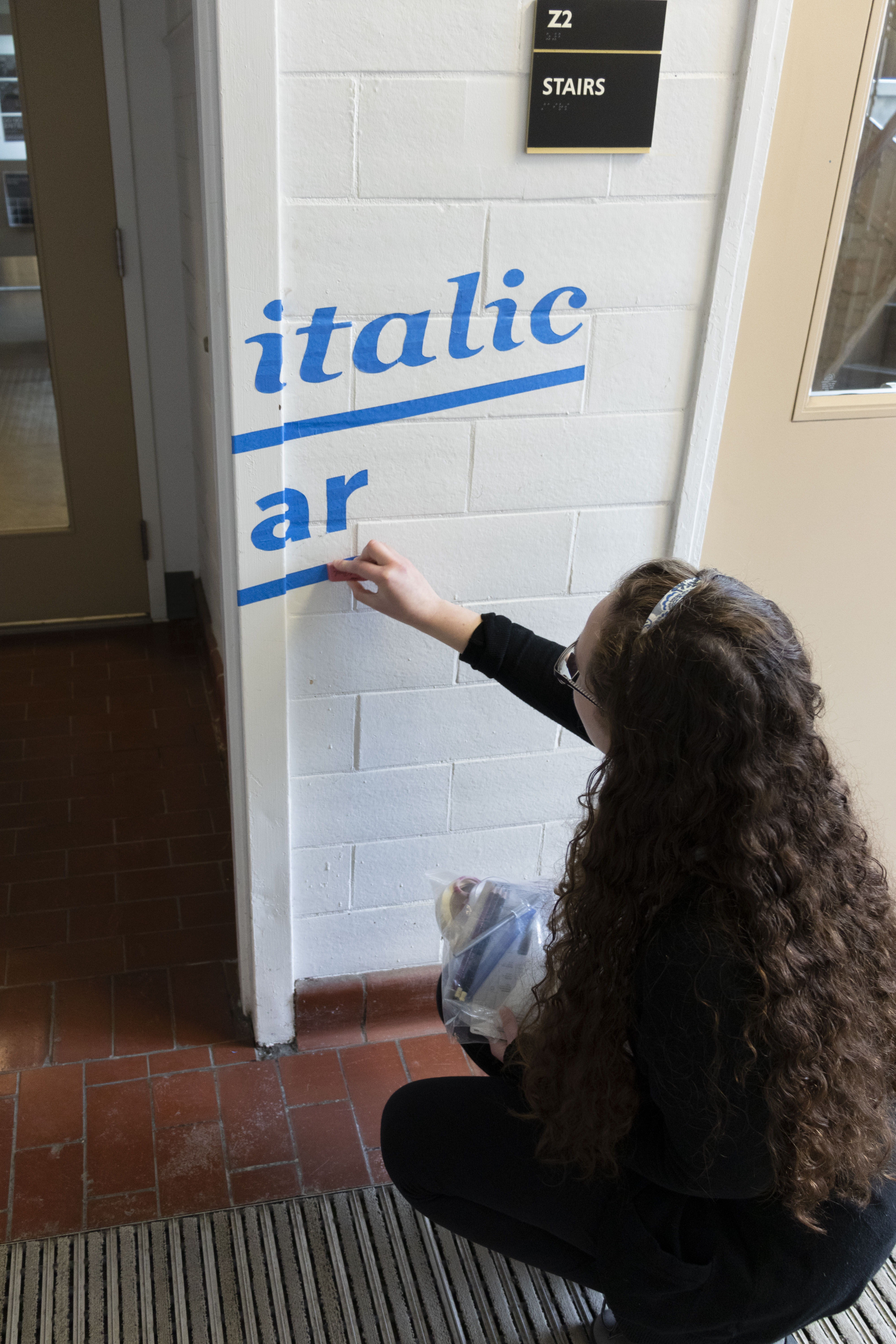
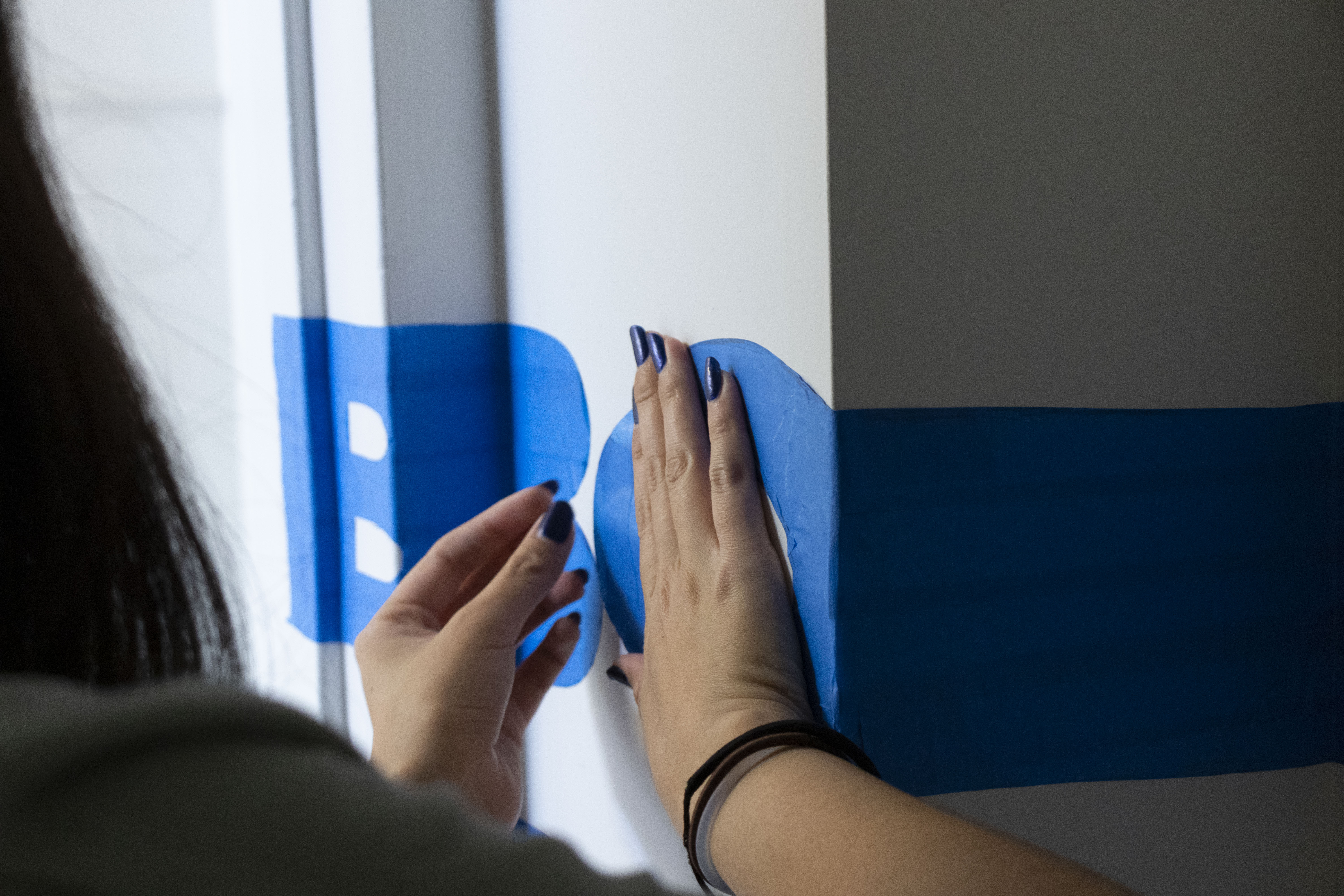
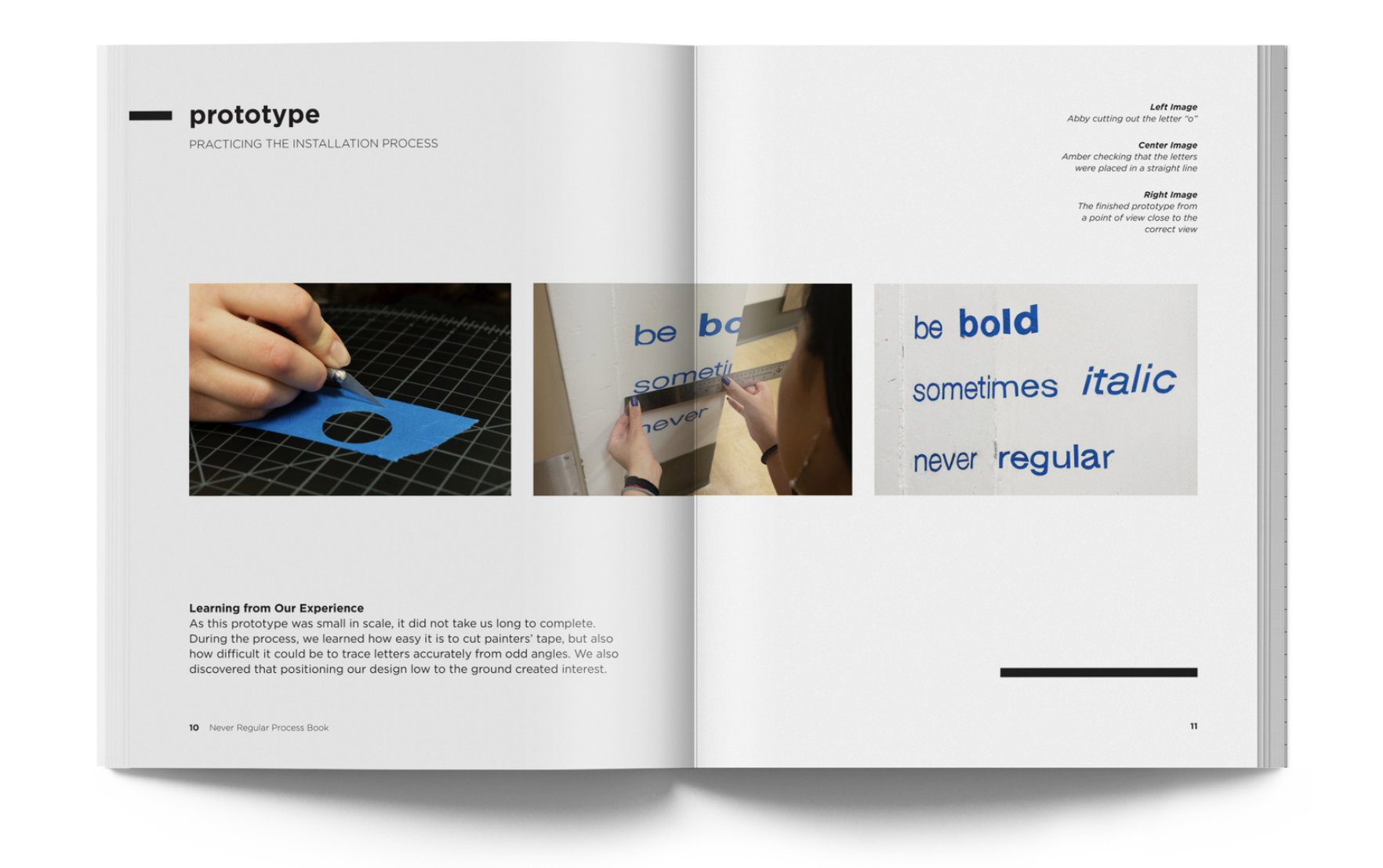
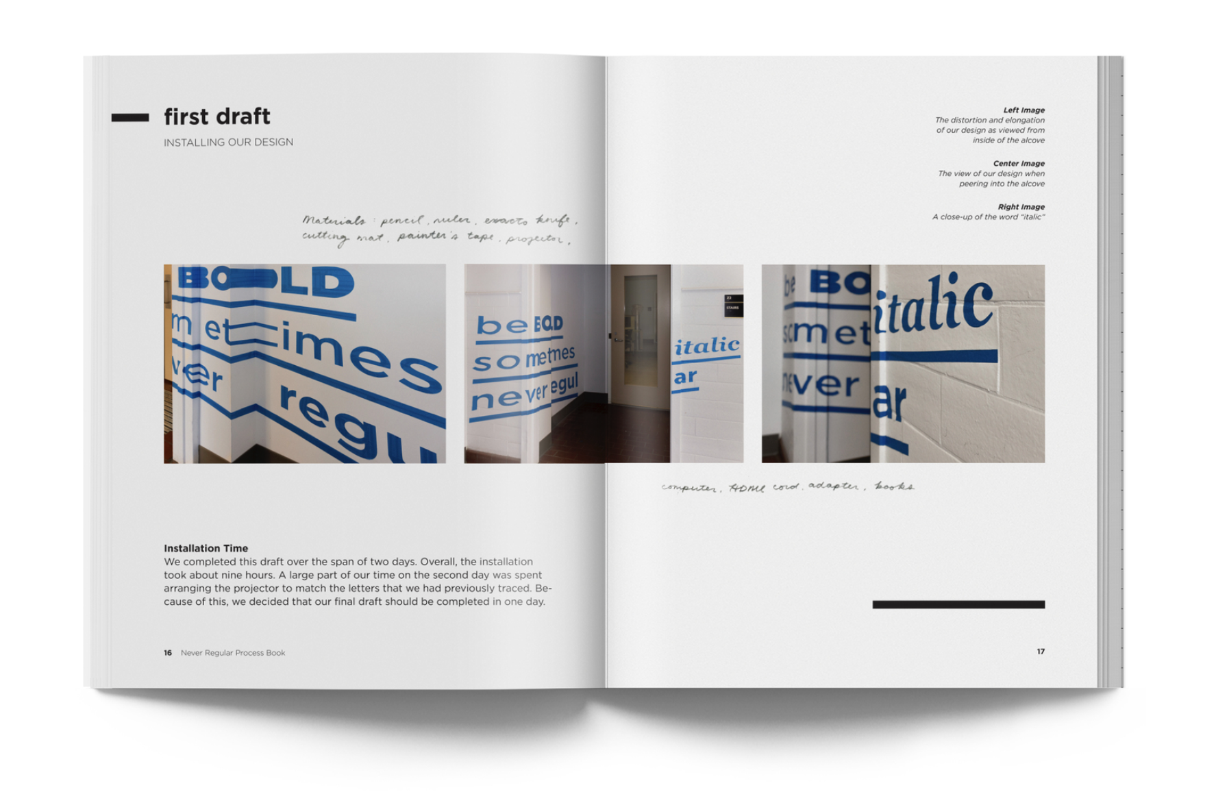
We next went on to test different ways of creating the instillation. The building did not allow us to paint the walls so we turned to different types of tapes and adhesieves. We did a practice round first using painters tape and testing out how to project the image. We would then place the tape onto the wall and trace the letters onto the painter’s tape. We would then take the traced pieces off the wall so we cut
them out on a cutting board and replace them back onto the wall in the correct projected spot. We learned very quickly that if the projector was moved at all, it was extremely difficult to get it lined back up correctly. We also found the painters tape’s width to not be ideal for taking on and off the wall as it took many pieces that would come apart and any over lap made the craft look sloppy.
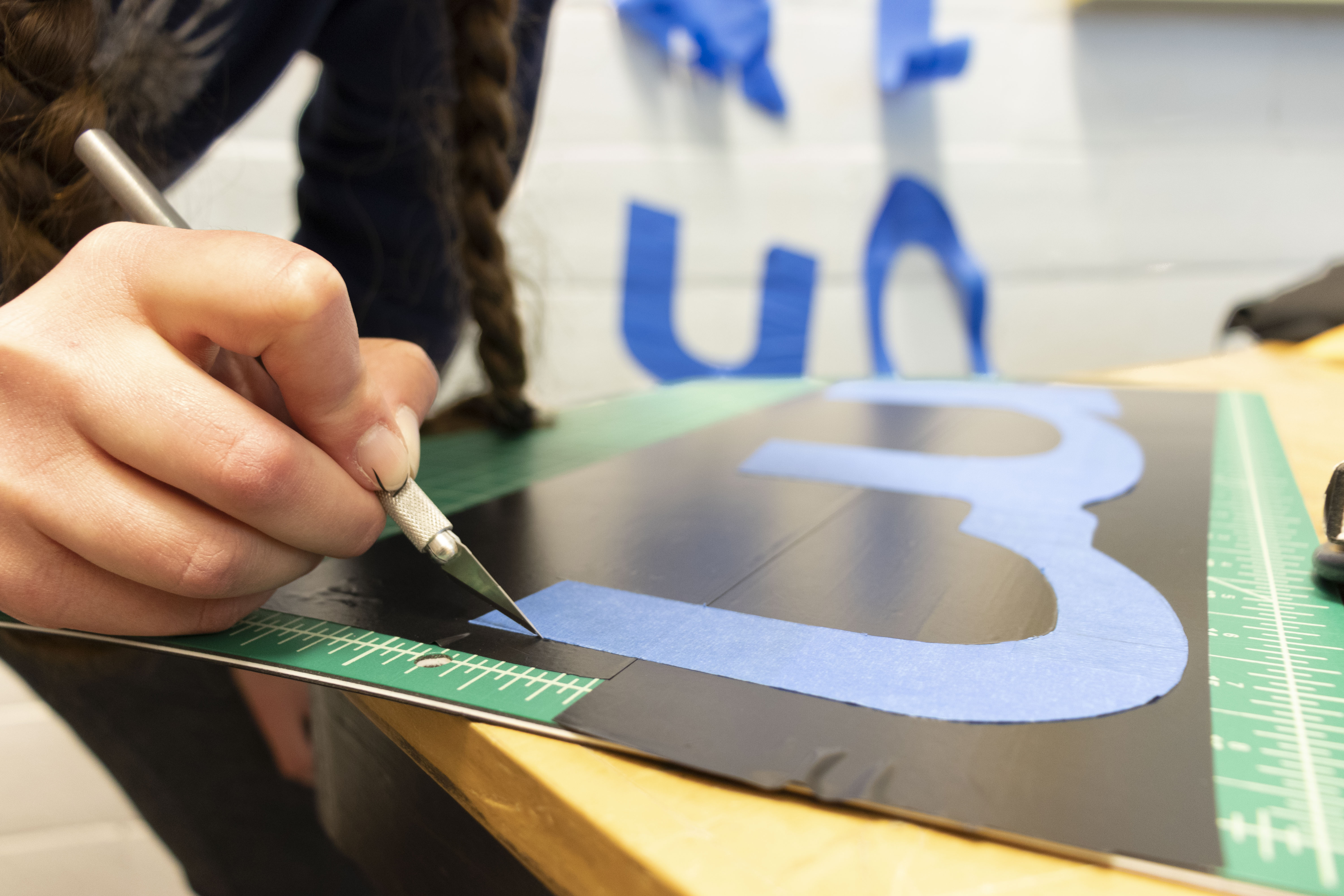
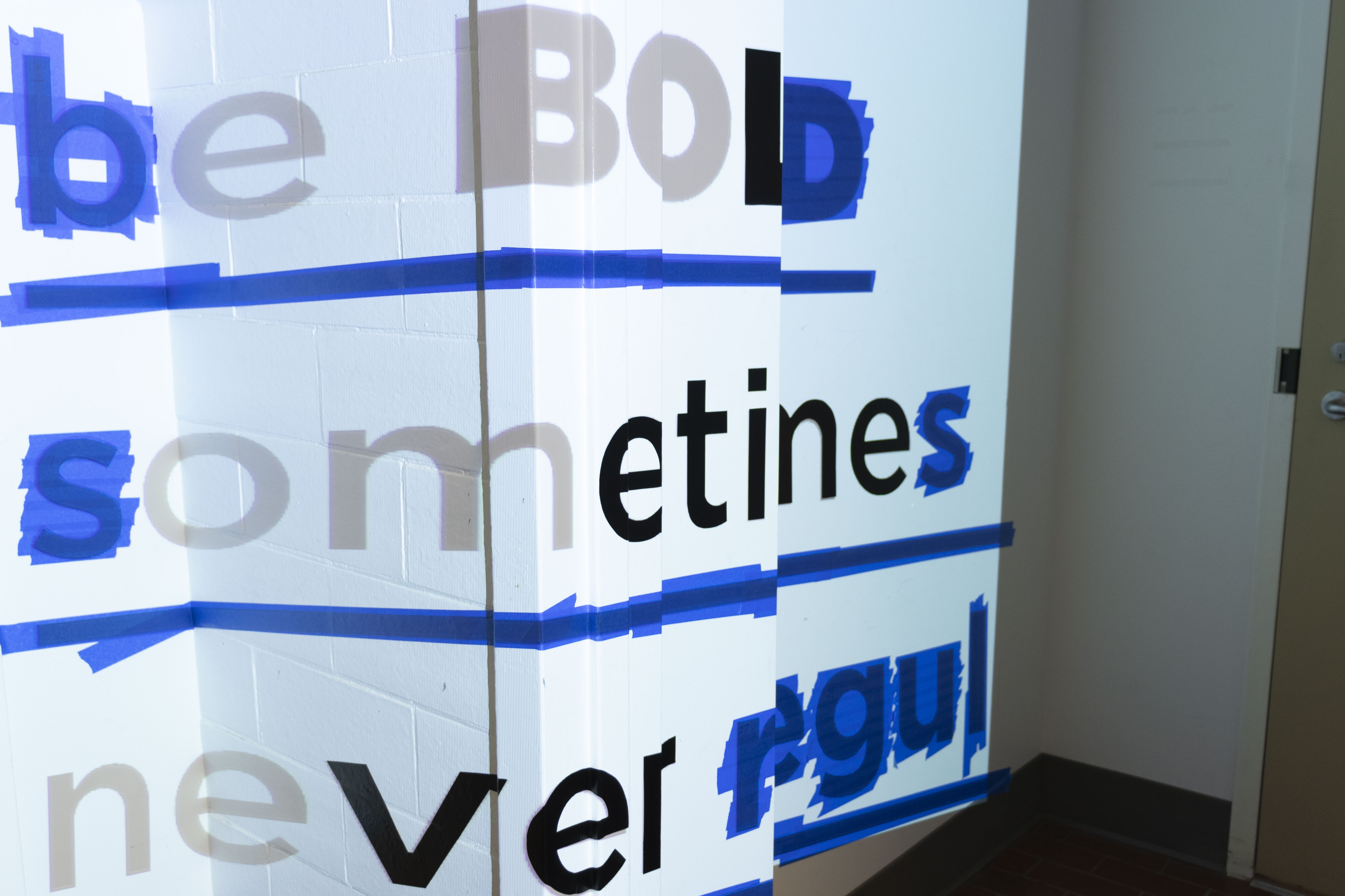
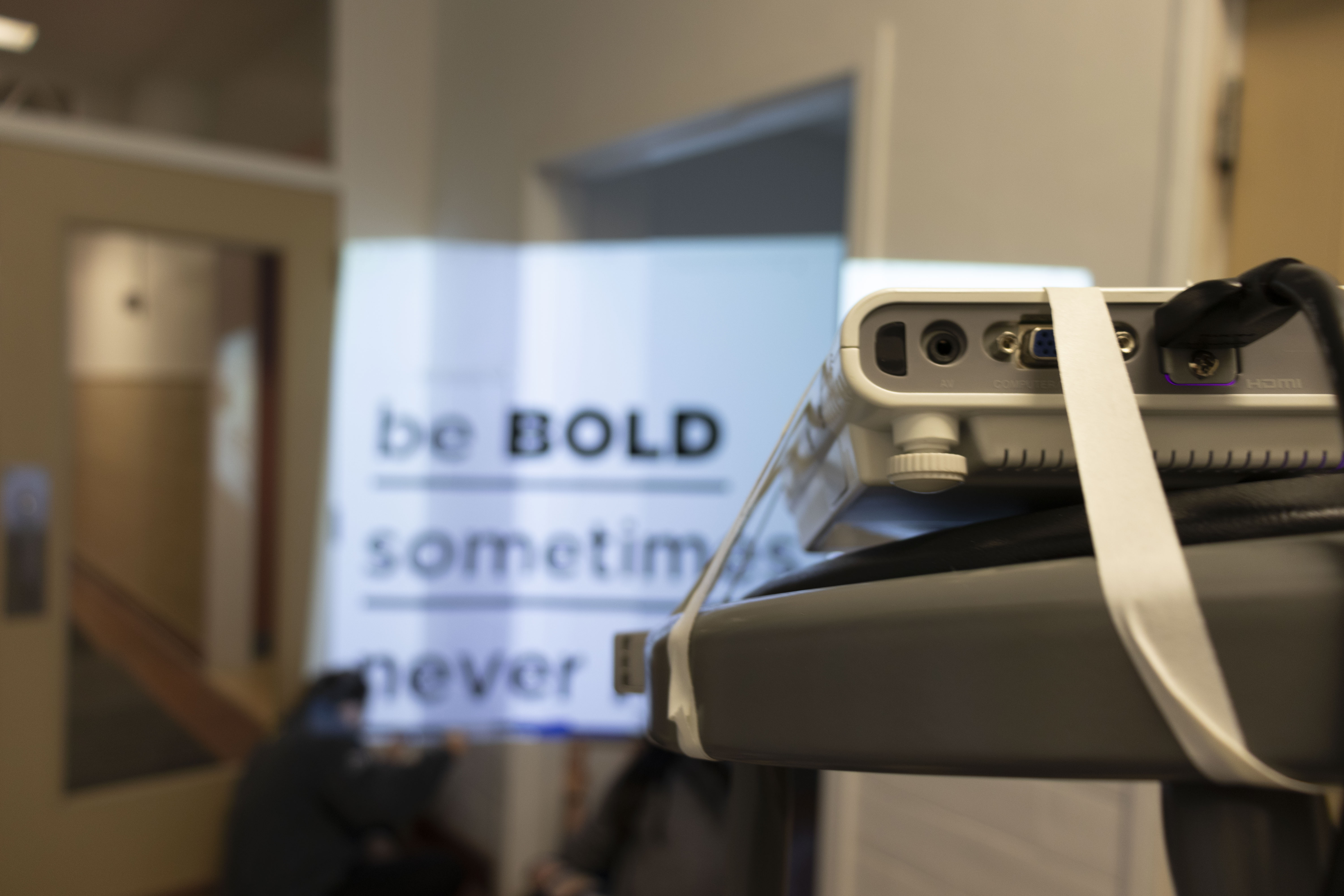
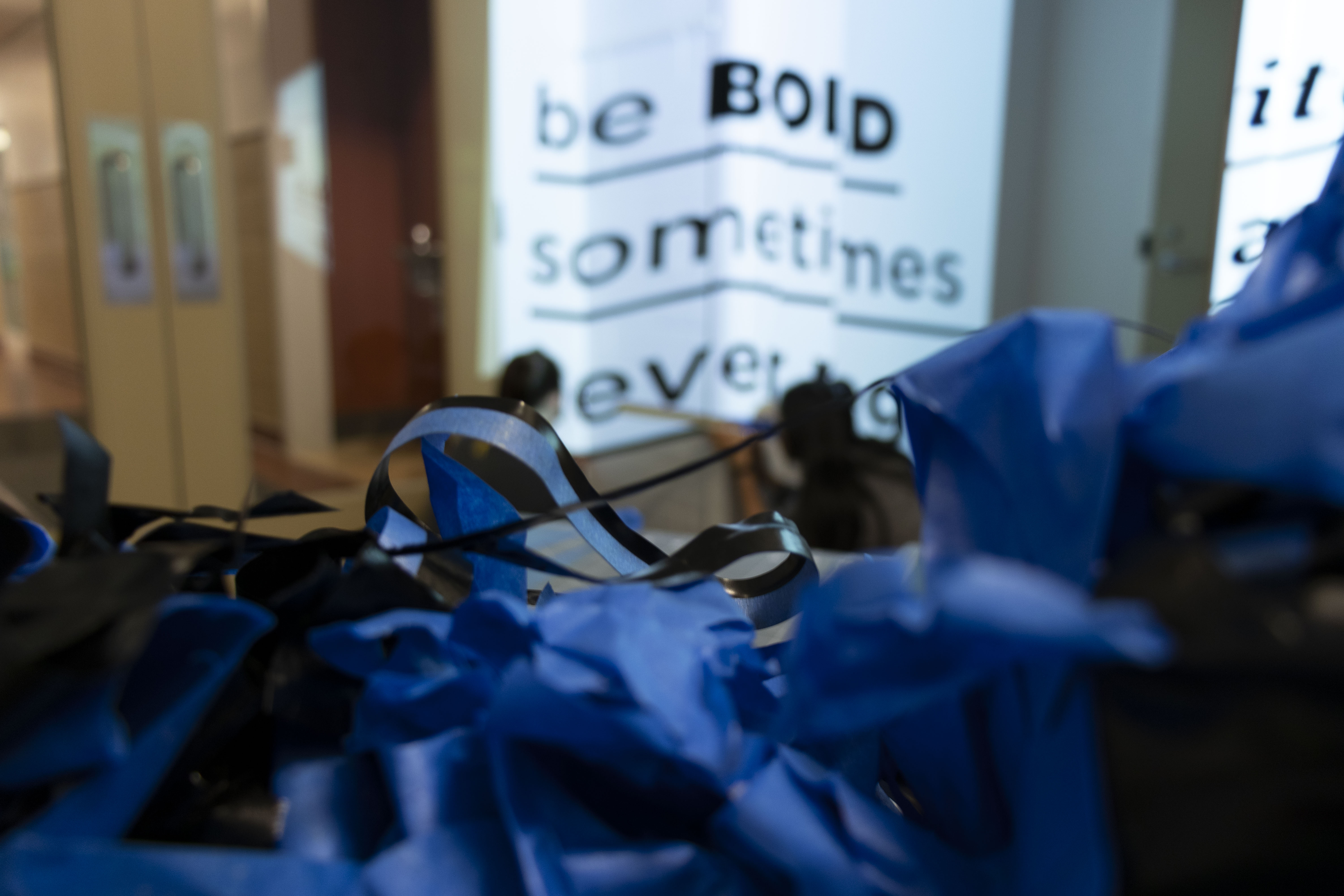
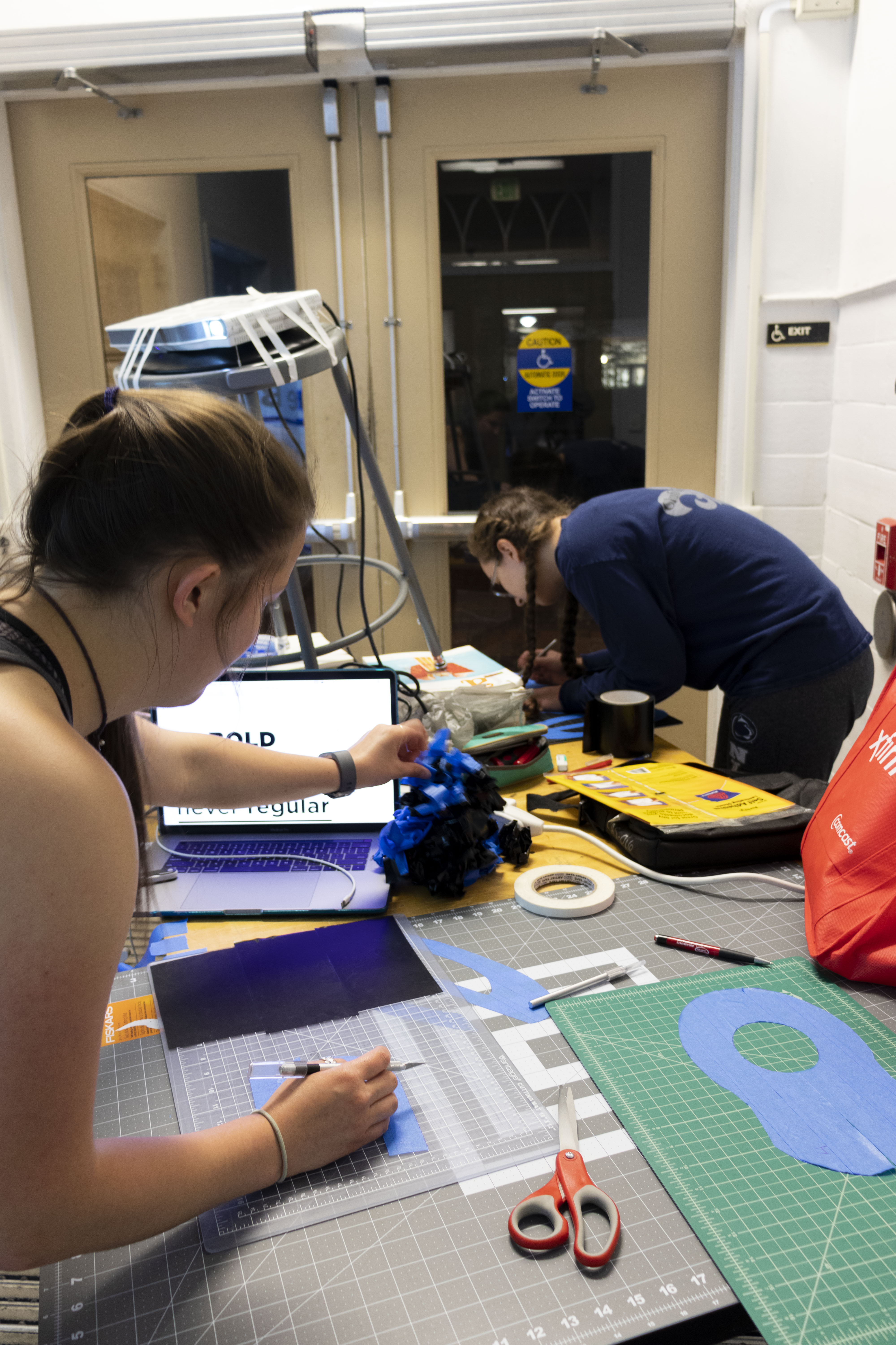
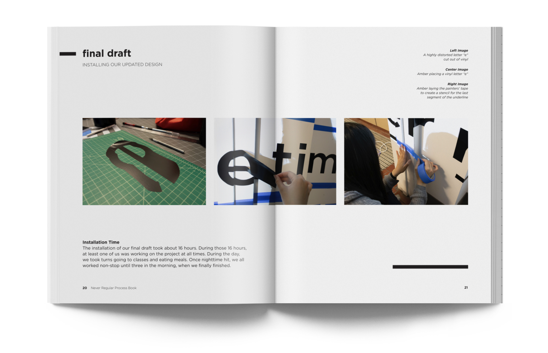
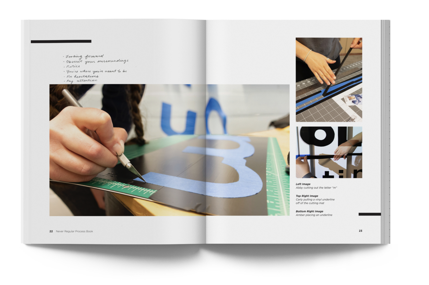
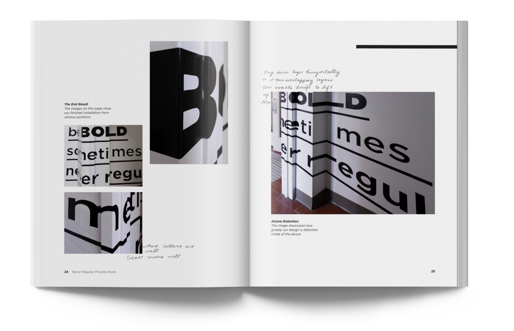
For our final instillation, we used part of the technic we practiced in our first draft, however, we added a step of placing the tape onto a vinyl tape that had a thicker width to help fix the craft issues in the draft. We also did the whole final instillation in one straight take so that the project wouldn’t be moved at all.
Process Book
Poster